This article is also available in French, courtesy of KolossalDrupal.org.
When it comes to starter themes in Drupal, there are two names that seem to always rise to the top: Zen and Blueprint. This article is about the latter, and how to get started with it.

So, why is Blueprint a good starter theme? First and foremost, it's incorporates the Blueprint CSS Framework, an open-source project all on its own. The framework was designed to speed up CSS development time - specifically "layout" CSS where various HTML elements are positioned on the page. It also provides "sensible typography", a stylesheet for printed pages, and other features. The "layout" aspect of Blueprint is based on a grid-based system that breaks up the page into any number of columns that are very accessible from CSS. This is where the true power of Blueprint appears.
What advantage does this give you as a Drupal theme developer? First and foremost, it cuts down on your development time by virtually guaranteeing that (providing you use the Blueprint CSS as designed) cross-browser CSS "float" issues are a thing of the past. Need a page layout that breaks up an entire page into any number of blocks? No need to get the Panels module involved, it's easy to do with Blueprint. You can Panel-fy pages without all the overhead (or learning curve).
Download, Download Again, Install, Enable
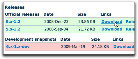
The Blueprint Drupal theme that you download from Drupal.org will only get you halfway there. Unlike most Drupal themes, Blueprint actually incorporates a separate open source project - the Blueprint CSS Framework. So, you'll need to first download the Blueprint theme from Drupal.org:
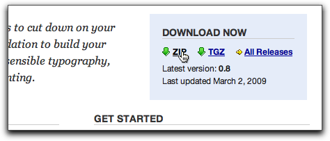
Then go to BlueprintCSS.org to download the framework.
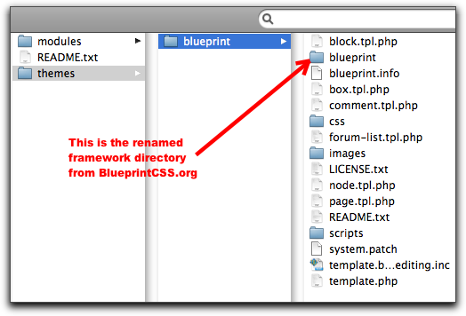
As with any Drupal theme, uncompress it, then place it in your "sites/all/themes" directory. Then, take the Blueprint framework file you downloaded - which usually has some crazy long name that begins with "joshuaclayton-blueprint-css-..." - uncompress it, and rename it to just "blueprint" and place it in the blueprint theme directory. When you're done, you should have a "blueprint" folder (the framework one) inside another "blueprint" folder (the theme one). Confusing enough for you?
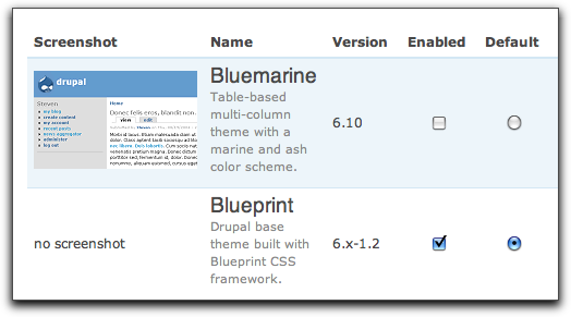
At this point, you're ready to enable the theme. Login as the site administrator and head on over to your "admin/build/themes" page and click to "enable" and make "default" the Blueprint theme.
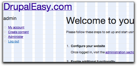
After you submit the theme chooser form, head on over to the home page of your site. Assuming you're working with a fresh install of Drupal 6, it should look something like this:
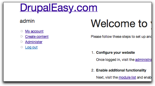
Pretty magical, eh? Okay - not really, but the point of the Blueprint theme isn't to look pretty out-of-the-box, it's to provide a solid foundation for you to build on. Mission accomplished, so far.
The Plan
So, now that you have the Blueprint theme up-and-running, what are you going to do with it? How about you create a home page with a bunch of regions that we can drop blocks in? Perhaps something like this...
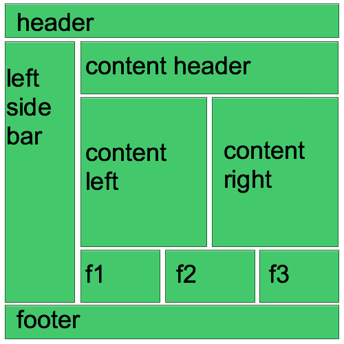
Please excuse the crudity of this model, I didn't have time to build it to scale or to paint it. (bonus points if you can name the movie I just ripped off this quote from - first one to name it in the comments below wins).
To accomplish this, we need a plan:
- Create a subtheme of Blueprint
- Add the new regions to your theme's .info file
- Create a separate page template file for the home page
- Add the Blueprint CSS Framework magic to the new template file
- Be amazed
- Fame and fortune
Simple enough? Sweet. Let's go.
Create a Subtheme
Although it's not required, creating a subtheme can save you a lot of hassle down the road when it is time to upgrade your site. By creating a subtheme, you effectively separate all your customizations from the base theme. It's a good thing.
It's quite easy to create a subtheme, here's the low-down:
- Create a new, empty folder in your sites/all/themes directory
- Create an .info file
Rather than going through all the not-so-scary details, check out this page on Drupal.org for a quick and dirty run-through. At the end of this article, you'll be able to download my subtheme developed for this article as well.
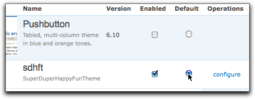
I decided to call my subtheme "sdhft" (Super Duper Happy Fun Theme), so I created at "sdhft" directory with "sdhft.info" and "sdhft.css" files inside. The "sdhft.css" file is empty - it has no content - yet.
Once you're done, head back over to "admin/build/themes" and "enable" and make "default" your new subtheme.
Create the Regions
According to our mockup above, we're going to need to add a number of regions to our page template. These regions will be able to accept any type of content via the "admin/build/block" page - they will be fully-functional Drupal regions.
Adding new regions to your theme is a two-step process: you need to add them to your theme's .info file and then expose those regions in a page template. We'll take care of the first step now, and the second step in the "Blueprint Magic" section below.
To add a region to a theme's .info file, simply add a new line of the format:
regions[variable_name] = label
The "variable_name" is the PHP variable that we'll call the region content from in our template file. The "label" is what the region will be called on the "admin/build/block" administration page.
It is important to note that the "variable_name" must not have any spaces or funky characters in it!
Based on my mockup, I'll need to add the following lines so that my entire "sdhft.info" file looks like:
name = sdhft

description = SuperDuperHappyFunTheme

core = 6.x

base theme = blueprint

stylesheets[screen,projection][] = sdhft.css
regions[left] = Left sidebar
regions[right] = Right sidebar
regions[content] = Content
regions[header] = Header
regions[footer] = Footer
regions[content_header] = Content Header
regions[content_left] = Content Left
regions[content_right] = Content Right
regions[f1] = Footer 1
regions[f2] = Footer 2
regions[f3] = Footer 3
The first block of regions I just copied from the blueprint.info file - the second block is based on the mockup.
Creating the Home Page Template
Next, I want to create a new page template that will only be used for my site's home page. Luckily, Drupal has some built-in smarts for doing stuff like this, so I only needed to copy the page.tpl.php from "sites/all/themes/blueprint", paste it into my subtheme's directory ("sites/all/themes/sdhft"), and rename it to "page-front.tpl.php". The "-front" is special, in that it tells Drupal to use this page template for the home page as defined on the "admin/settings/site-information" administration page.
There are other ways to name page templates to be used in other cases - more information on this is available here.
Now, here's the tricky part: at this point, your template will never been used. When creating a subtheme and overriding a template (which is what you're doing by creating page-front.tpl.php), the new template will not be seen by Drupal unless the "base template" is also present in the same directory. The "base template" in this case is the original "page.tpl.php" from the Blueprint theme. So, you need to copy "page.tpl.php" from the Blueprint them to your subtheme's folder - only don't rename it
SuperDuperHappyFunTheme Home Page!!!!
Then, go to your site, rebuild your theme registry (by clicking the "Clear cached data" button at the bottom of the "admin/settings/performance" administration page), then visiting the home page. You should see something like this:
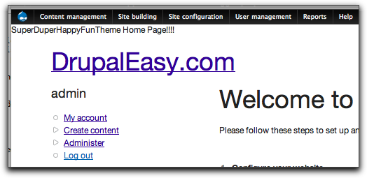
Note that I have the most excellent Administration Menu module enabled in the previous image. You can also clear the theme registry via its Drupalicon menu.
This proves that Drupal is using the new "page-front.tpl.php" for the home page. Sweet. Feel free to remove your temporary text.
Blueprint Magic
Finally, it's time to do some "Blueprint-y" stuff. The first thing you'll need to do is learn a little bit about how the Blueprint CSS framework works. By default, Blueprint is a 960-pixel wide fixed-width layout. As it is a grid-based layout, those 960 pixels are divided up into 24 40-pixel columns (actually, they're 30 pixel columns with 10 pixel gutters). The framework has a handy way of viewing those columns - the easiest way is to add the "showgrid" class to your "container" element. Blueprint uses the "container" class to group all the Blueprint columns. In your case, open the page-front-tpl.php file, and add the "showgrid" class as follows:
Refresh the home page of your site and giggle with delight in your new background grid:
There's only three types of Blueprint CSS classes that you'll need to use for this example: "container", "span-##", and "last". You've already learned all we need to know about the "container" class. The "span-##" classes are used to specify the width, in columns, of various elements on your page. For example, using the Firefox browser with the Firebug extension installed, I can inspect the left hand column HTML element and see this:
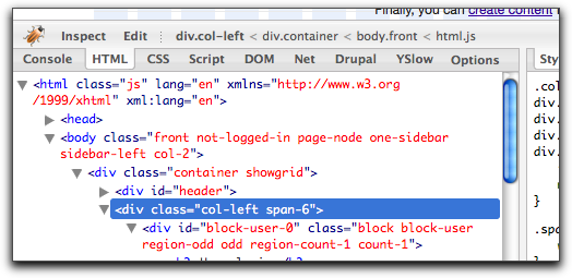
This shows that the left-hand column has two classes applied "col-left" and "span-6". The "span-6" class is a Blueprint class that says that this column is 240 pixels wide (each Blueprint column is 40 pixels multiplied by 6 columns is 240 pixels [Yikes! Math! Scary!]). You can change the "span-6" to another value using Firebug and see the results instantly. Try changing it to "span-2" (2 columns, 80 pixels) or "span-16" (16 columns, 640 pixels) to get a feel for how it works.
The final class you need to learn about is "last". This is quite easy to understand - you need to apply this class to the last column in a row (see how clever the authors were in their naming conventions?) Looking at our mockup, the "last" class will need to be applied to the "content_header", "content_right", "f3", and "content_footer" regions.
Using these three classes and a bunch of nested "div" elements, you can now proceed happily and create the necessary markup. The mockup uses the base theme's existing header, footer, and left sidebars, so all you really need to take care of is the new regions we want to add to the main content area. With that in mind, the necessary HTML is fairly easy:
As you can see, "each" row from the mockup is contained within a div, set to the total width ("span-18") of the main content area. Then, within each "row", I set up the various region "divs", each set to their individual widths ("span-9", "span-6").
I also went ahead and added an additional class to each region ("col-content_header", "col-content_left", etc...) so each region can be easily targeted for CSS theming later on, if desired.
Keep in mind that since we're dealing with a fixed-width layout, we have a limited number of columns (24). It is important that each row of "div" elements is a total of 24 columns. In the code above, each row has 18 columns - remember that the left sidebar is 6 columns wide, giving us 24 columns.
The Blueprint theme defines the widths of the sidebars and content areas in the "phptemplate_preprocess_page()" function of template.php. Modifying those values is an excersise left up to the reader (I've always wanted to say that).
The next step is to add this new HTML to your page-front.tpl.php file and add the PHP "print" statements that will allow the desired content to appear in the new regions. For example, to get content that is assigned to the "Footer 1" region to appear in the new region, you'll need to add this:
Remember the "variable_name" stuff from the .info file? The "$f1" variable above is the same one, only with a "$" prepended.
To complete the template, you may also want to shift some of the other printed variables out to some of the new regions, remove the $content variable, and move the existing "footer" div to outside of the main content area (so that it appears below everything, including the left sidebar). Rather than showing all of the code for that here, I've included it as part of my sample subtheme "sdhft" available for download below.
As part of the subtheme, I've included a single CSS definition to help identify the various regions I created:
.col-content_header .block,

.col-content_left .block,

.col-content_right .block,

.col-f1 .block,

.col-f2 .block,

.col-f3 .block,

.col-content_footer .block {

  border: 1px solid red;

}
This CSS definition simply adds a red border to each of your new regions. Feel free to delete it (as well as the "showgrid" class in page.tpl.php) once you're comfortable with the layout.
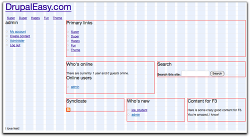
At this point, your new template is ready for use! Head over to your admin/build/block page, and start populting each of your new home page regions with some content. Here's a quick look at what mine looked like after I added some content:
Using this method, it's easy to create multiple page templates that look a lot like Panels, but without all the overhead. This method works great if you're dealing with page templates that don't require any advanced features that Panels provides (like context, arguments, or relationships).
I stuck to the basics for this article, but there's a lot more cool stuff you can do with Blueprint - I highly recommend the Blueprint cheatsheet for a quick rundown and handy reference.
Comments
Great article! Been wanting
Great article! Been wanting to check out blueprint for some time now.
Oh and the quote was taken from none other than Doc Brown in Back to the future. Next time you watch the trilogy turn it into a drinking game by taking a shot anytime he says "great scott!"
Very good overview, I wish
Very good overview, I wish I'd had it a year ago before trying to use Blueprint on a certain site we worked on..
Excellent information.
Excellent information. Thanks much Mike. I've never used Blueprint before but it certainly looks quite handy.
Really great
Really great article.
Thanks.
Thanx for the info ! I read
Thanx for the info !
I read about the blueprint framework in the "front end drupal" book. This is a nice example !
Hey, thanks for this. I am
Hey, thanks for this. I am just getting started with drupal, and need all of the help I can get :)
Added to DrupalSightings.com
Added to DrupalSightings.com
errata: col-content_footer
errata:
col-content_footer span-18 last
should read:
col-content_footer span-24 last
to match the sketch of THE PLAN...
but I know plans change a lot during implementation...
but nevertheless a realy nice write up
Spuky
Spuky, Nice catch! I have
Spuky,
Nice catch!
I have fixed it in the article above.
Much appreciated,
-mike
Well done!
Well done!
Thanks Ryan! I will check it
Thanks Ryan! I will check it all out and dig a bit deeper. Matt
Great piece. Finally
Great piece. Finally convinced me to move away from Zen.
it is very good if you see
it is very good
if you see this site:
http://breathecast.com/
can you tell me how do you break up this content, it's like they have small panel. I can say 6 small container. can we do that?
how should i define the content and div tag?
I am sorry I am very new in drupal
thank you for your help
Lewis, Your question is a bit
Lewis,
Your question is a bit out of the scope of this "getting started" article. It is meant to be a good place to start learning how to work with the Blueprint theme - not as a resource to learn how to create every layout using Blueprint.
Feel free to contact us for additional help for your specific issue.
Thanks,
-mike
error when i type as you said
error
when i type as you said this part
SuperDuperHappyFunTheme Home Page!!!!
but it doesn't show
either in page or page-front
did i miss something?
Really clear, simple and .. I
Really clear, simple and .. I can use it!
OK. No one answered the
OK. No one answered the trivia question yet. It's from one of my favorite movies: Back To The Future. When Dr. Brown built the replica of the town to show Marty how he would juice the DeLoean when the lightning struck the town's clock tower. You know, for the 1.21 gigawatts needed to power the flux capacitor.
Great scott I need to get a life!
Darrin
:-)
Thanks for the article. We
Thanks for the article.
We designed a site recently using blueprint framework in drupal. However i was not using 'drupal blueprint theme' and we ended up adding lots of logic in page.tpl.php instead using template.php.
Please correct this info from your article.
Blueprint default container width is 950px and the formula is total width = (columns *40) - 10. This is clearly mentioned in "Blueprint CSS Cheatsheet" attached with the article.
Also Blueprint is not limited to 950px. You can use any size with Blueprint CSS Grid Generator. Google for the link, when i add the link spam filter is blocking my comment.
noussh.com
Noussh, You are correct - the
Noussh,
You are correct - the actual default fixed width for the Drupal Blueprint theme is 950px. I forgot to remove the 10px gutter of the last column.
Thanks,
-mike
Pingback
[...] theme como alternativa a Zen para desarrollo de plantillas, en Drupal Easy. (en [...]
It's a great article, and
It's a great article, and just what I was looking for...unfortunately something didn't go quite right for me. I downloaded and unzipped/installed/enabled sdhft .
When I went to the home page, everything was dead up against the left hand column, and the 'grid' did not show. I went ahead and added some text in the page-front.tpl.php...and that did show up, so I know that it's reading the right file, but it doesn't look anything like your first screenshot.
If it's any help, I know that the 'container showgrid" is NOT showing the grid on my page? I went back and disabled every other theme (except blueprint). Any suggestions? I'd love to understand it.
Mark
Found The Problem Hopefully
Found The Problem
Hopefully this will help someone...if you have the problem I described above I'll tell you how I fixed it. When I had downloaded the 'framework' (you have to have that along with the Blueprint theme from Drupal) I unzipped it and renamed it to blueprint_fr for framework. The WILL NOT WORK. It must be called blueprint.
It was a bit confusing to me, but now I've got it:
sites/all/themes
blueprint (main theme folder from drupal)
------->blueprint (this is the framework folder inside of the theme folder)
------->css
------->images
------->scripts
Thanks for the great info and
Thanks for the great info and taking the time to write up this tutorial!
Quick question, how to I
Quick question, how to I override blueprint.css? There are some class in the node section of the blueprint.css I need to modify. Like changing padding and margin to 0.
thanks,
If you created a subtheme,
If you created a subtheme, then simply add the exact same definition in your subtheme's CSS file and make the appropriate changes.
-mike
Pingback
[...] Continue reading here: Getting Started with the Blueprint Theme | DrupalEasy [...]
A quick comment on the
A quick comment on the creation of the subtheme. Writing an .info file such as the one you posted here will cause a minor problem.
The latest version of the blueprint theme does not add the css files to the "all" category, but instead to the "screen,projection" one.
So, if you write in your subtheme's info file:
stylesheets[all][] = sdhft.css
You won't be able to override anything, because the css file will be called before the regular blueprint module css files.
If instead you write:
stylesheets[screen,projection][] = sdhft.css
the css file will be included in the expected order.
Thanks for the article! I'm currently testing this, let's see if it manages to replace my current favourite, the basic theme! :-)
Vermario, Great catch - I've
Vermario,
Great catch - I've updated the article.
Thanks,
-mike
Great article. I've been
Great article. I've been using blueprint with Wordpress for a while now and this is big help as I dip my toe (!) into Drupal.
A tool I have used to help me figure out Blueprint is Boks. It's a small app (Adobe AIR) that lets you visually design your layout and then output the HTML and CSS. It can be found here:
http://toki-woki.net/p/Boks/
Thanks again.
I would like to know if it's
I would like to know if it's possible to add a php if statement inside the page.tpl file that will let you use the same .tpl file for both a 2 and 3 column layout, depending on whether you have (for instance) a right block. If a right block is there, then it prints a span-12, if not, then a span-18.
IF
<?php if ($right): ?>
THEN
(a middle column for content in a 3 c layout)
ELSE
(a bigger left column for content in a 2 c layout)
Is this doable?
Thanks.
appending previous
appending previous comment...
IF
<?php if ($right): ?>
THEN
(a middle column for content in a 3 c layout)
ELSE
(a bigger left column for content in a 2 c layout)
3djeff, Yes, it's possible,
3djeff,
Yes, it's possible, but this type of functionality is actually handled by blueprint in the template.php file in the phptemplate_preprocess_page() function.
-mike
how do i make the 950px width
how do i make the 950px width of blueprint wider? i used the blueprint css generator, and tried replacing grid.css inside the blueprint framework, but the grid images is still staying at 950.
I'm following the tutorial being given on this site as i want to have more columns on my site.
Noah, It's tricky - luckily,
Noah,
It's tricky - luckily, I've never needed to do it. I'd start here:
http://wiki.github.com/joshuaclayton/blueprint-css
-mike
thanks! ill start reading
thanks! ill start reading from there. anyway everywhere i read about theme widths, there's so much topic on 960. whats with the hype anyway?
there's no much room for content if using a newspaper/magazine style layout and you get a long page, when its set that way.
Can the regions be generated
Can the regions be generated using photoshop's slice tool?
I'm a bit late to this
I'm a bit late to this thread, but great article, loving the blueprint theme, just a quick question. I am trying to display a logo in the configure theme section for my child theme and it does not display. When I look into the page template I do not see a php statement to call $logo. Am I correct in saying that I have to code it in to get it to display?
Thanks, great tutorial, and helpful comments following.
r
Robert, I think Blueprint may
Robert,
I think Blueprint may not include the $logo variable by default in the page.tpl.php - just add a php print $logo as normal and see what happens.
Also, make sure you have the logo box checked in the theme settings page for your active sub-theme.
This was a VERY helpful post!
This was a VERY helpful post! Will you update it once the drupal 7 version is stable? I noticed that the dev version of blueprint 6 is moving the blueprint files into the sites/all/libraries folder, instead of the confusing blueprint/blueprint folder.
The line is from Back to the
The line is from Back to the future!!!
Hi there One thing (I might
Hi there
One thing (I might be wrong) but adding a border to the regions (to telp visualise the layout) can throw things out if say you have a span 18 and a span 6 which should sit on the same row - if you add the border the span 6 column will fall below.
Hi, just checking, has
Hi, just checking, has anything changed for the release of the blueprint 2.0 theme? I see some notes on the project page that suggest these instructions might be outdated, especially with respect to the location of the blueprint css files
Robert, You're right that the
Robert,
You're right that the Blueprint theme now supports the libraries folder, but I believe most of the tutorial still holds. The philosophy of Blueprint hasn't changed, as far as I can tell.
In that regard, most of the meat of this tutorial would apply pretty well to most grid-based themes: Ninesixty, Fusion, Omega and others.